Influencing through design
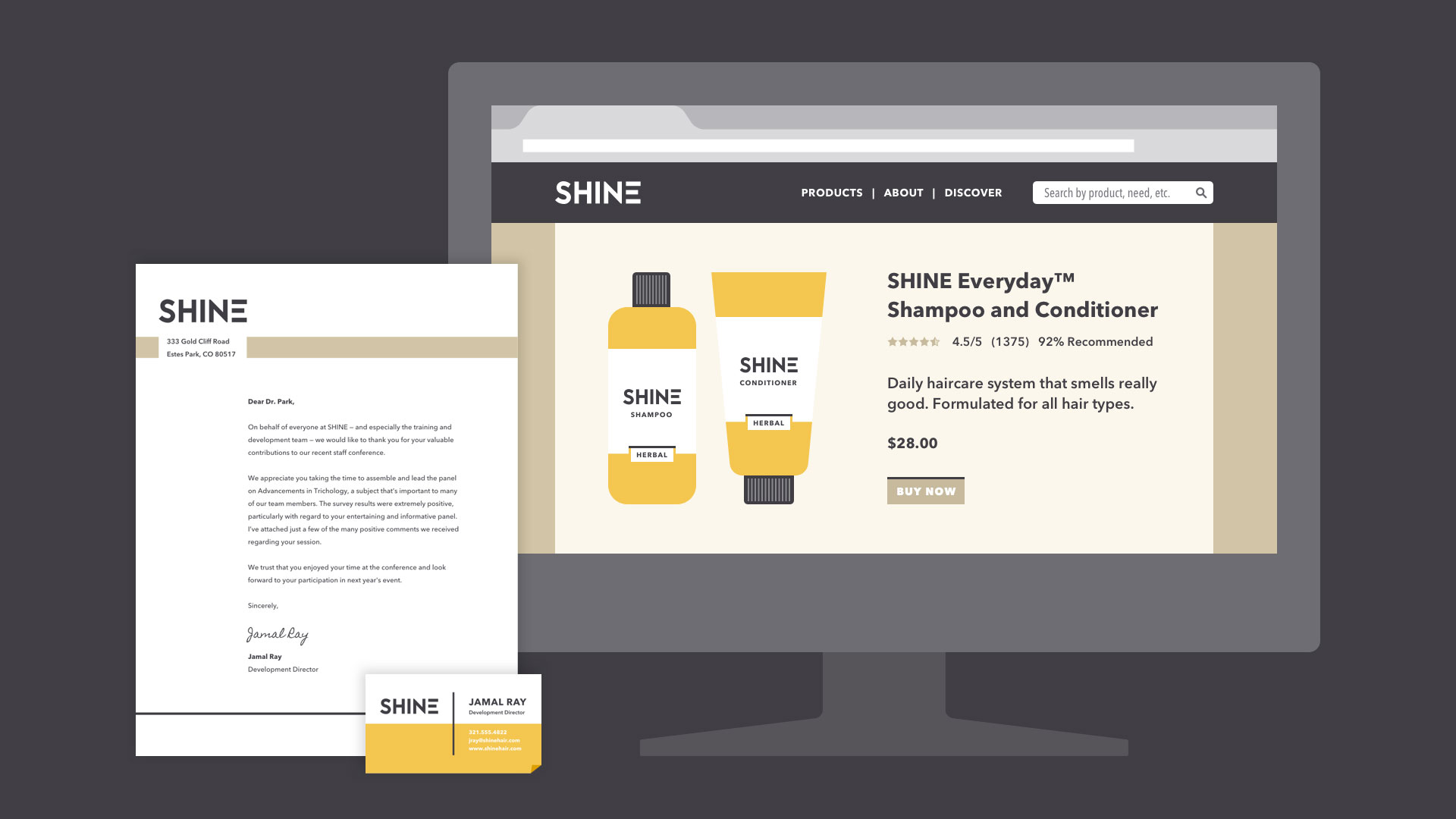
Branding and visual identity are all around us. Look closely, and you'll find them on websites, product packaging, and different types of advertising. Even personal items, like documents and business cards, bear some form of identity.
Simply put, branding is what other people think—about you, your company, your product, or your service. Visual identity is what that brand looks like, from your logo to your color choices and so much more.

Strong visuals can be very persuasive. Think of your own experiences as a consumer. Have you ever chosen a product simply because you liked the way it looked? Understanding visual identity can help you make more thoughtful design decisions, regardless of your role, medium, or skill level.
visual identity
Visual identity is kind of like a preview of your brand. Each part of your design is a clue that tells the viewer what they can expect. Your aesthetic can be traditional, modern, or a little more out there—every brand is different. No matter what, all of your design elements work together to show exactly what your brand is about.
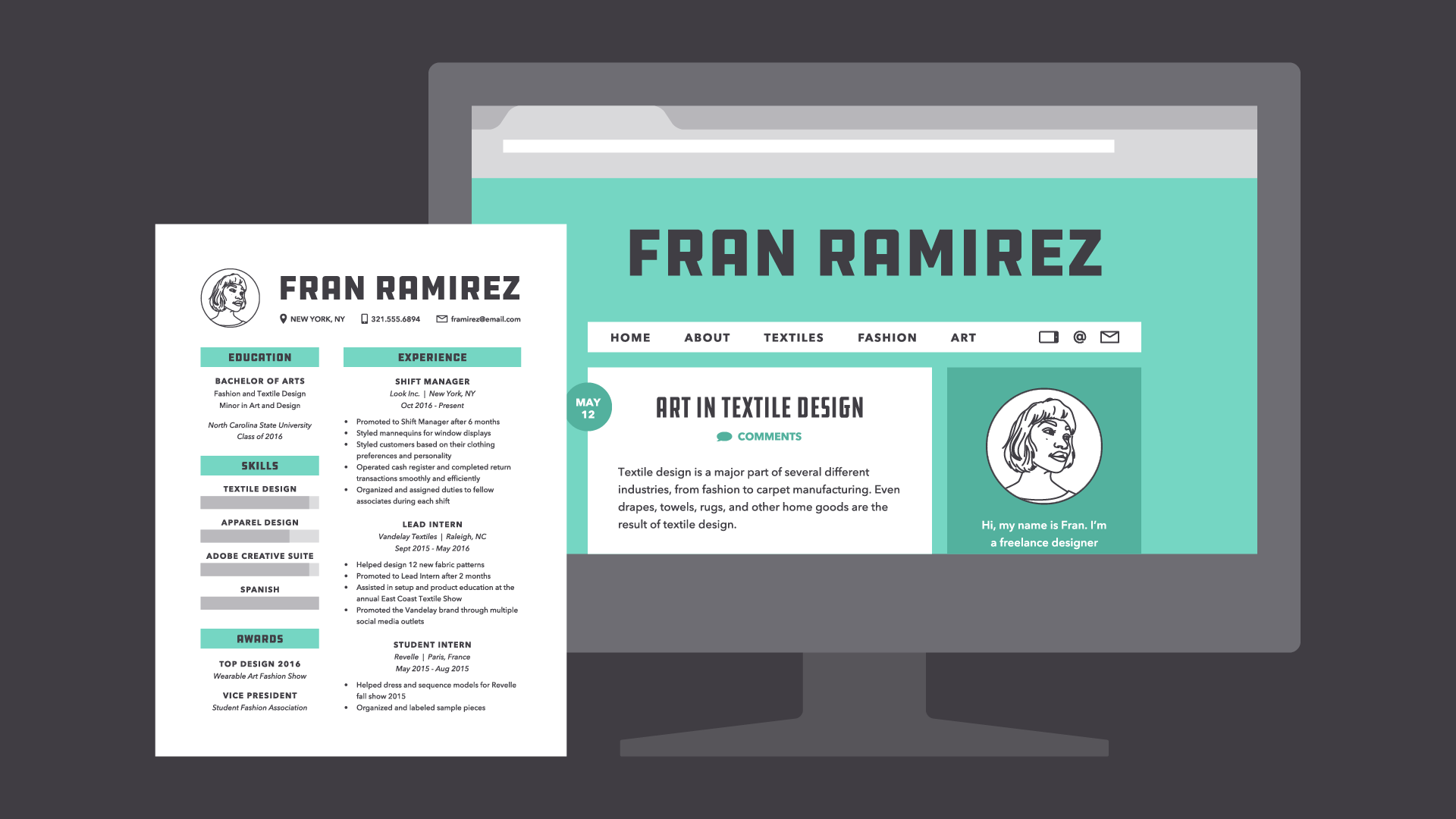
Of course, it's not all business. You can apply the concept of identity to almost any type of project, including personal designs. Whether you're updating your resume or looking for ways to enhance your blog, there are many benefits to having a consistent visual style.
Some companies use an actual style guide to keep their brand looking consistent. If you're just getting started with design, it's OK to take a more casual approach.
The main components of visual identity are logo, color, typography, and images. Read on to learn more.
Logo
A logo is what identifies your brand using a particular mark, type design, or both. The most effective logos tend to be fairly simple—something viewers will recognize and remember.
Every element of your logo contributes to your brand identity, including your font choice, colors, and other imagery. Change even one of these elements, and it can have a big impact on the way your brand is perceived.
In practice, logos are everywhere. You'll find them in corporate settings, as well as out and about, representing small businesses, freelancers, and other entrepreneurs. A logo is a lot like a literal brand—it's how people come to recognize you and identify your product or service.
That's why it's important to use it wisely. A logo that's pixelated, distorted, or too small to read could give viewers the wrong impression. Below, you'll find several examples of low-quality files.
To combat this, keep a master digital copythat's sharp, high in quality, and large enough for any project. This way, you're prepared for anything that might come along, whether it's a small print job or something much, much bigger.
Color
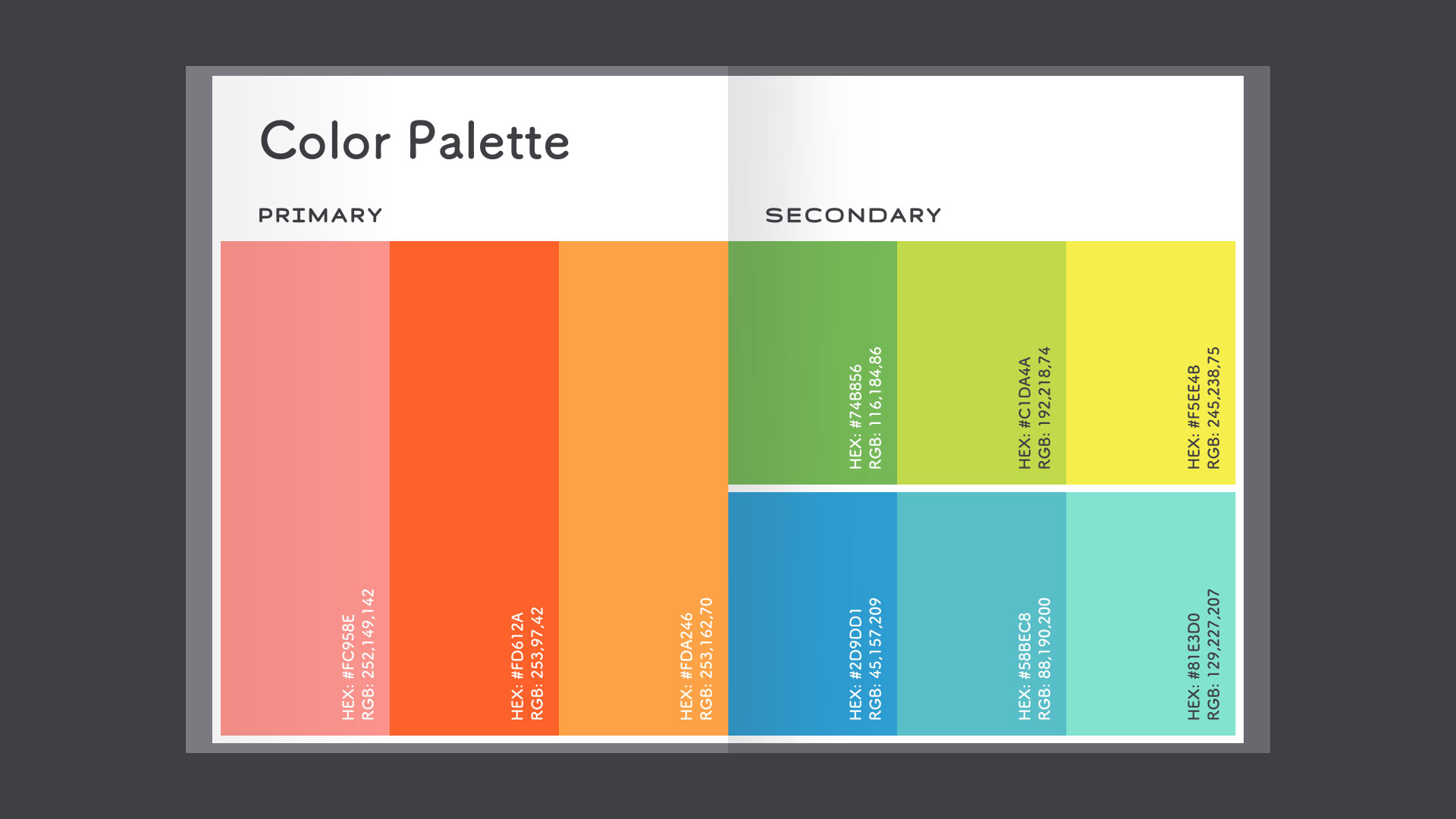
Color helps define your brand in a very powerful way. Not only does it make a strong impression on the viewer, but it also creates a sense of unity when used across multiple projects or platforms.

Most brands derive their main colors directly from the company logo. Additional colors can help you expand the main palette and further define your brand's personality and style.

There are lots of ways to use brand colors. Just be careful not to go overboard or ignore widely accepted design standards. Good color use is all about moderation.
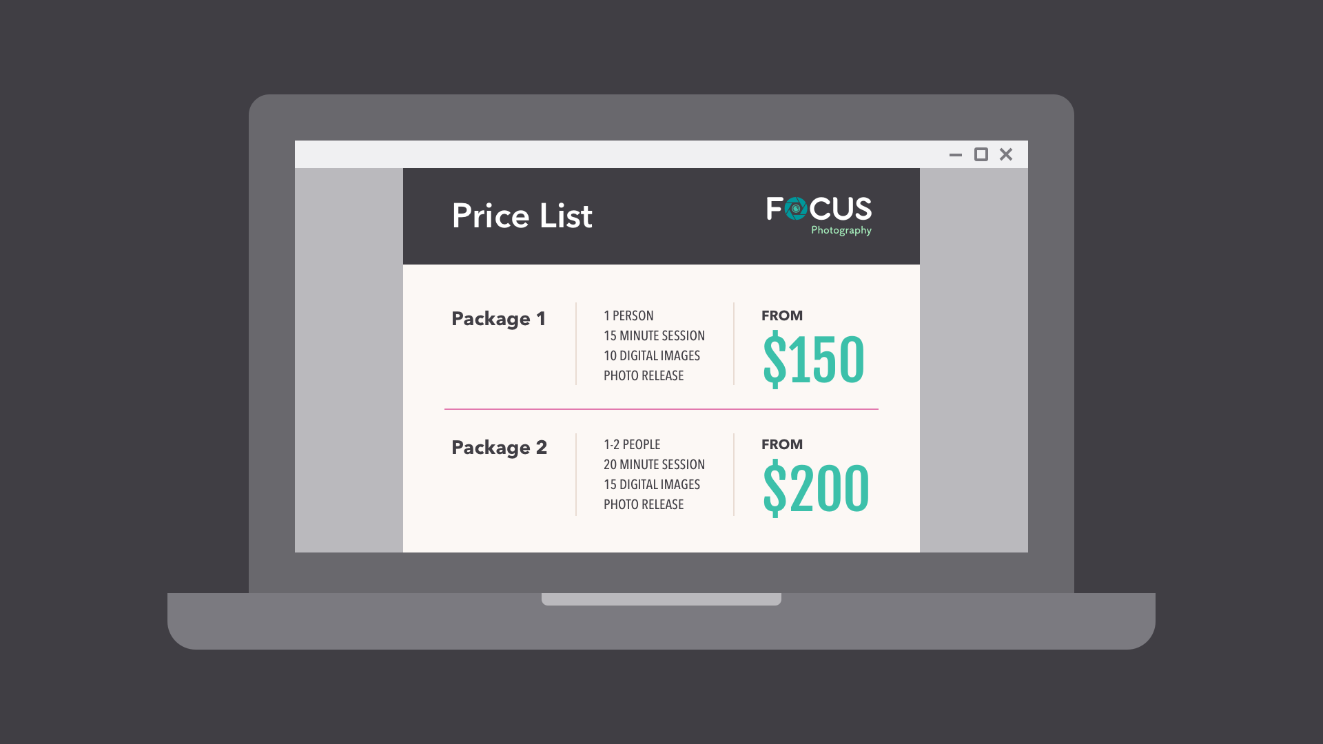
Avoid common pitfalls, like colors that vibrate or distract viewers from your work. For instance, in the image below, the text clashes with the background, making it difficult to read.
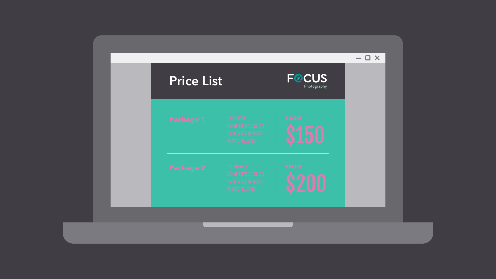
Make sure to include neutrals in your color palette, like black, gray, white, or off-white. This way, when you do use your brand's colors, they really stand out.
Typography
Text is one of the simpler aspects of identity, but it can be surprisingly expressive. All it takes is a different font, and you can subtly (or not so subtly) change the entire feel of your brand.

Most brands choose two to three fonts—often inspired by the logo—for basic, everyday use. Creative fonts should also be chosen with care and should be a reflection of your unique visual identity.

There are certain fonts that professionals know to avoid—fonts that were once popular but that are now considered outdated and overused. The fonts below are notorious examples.
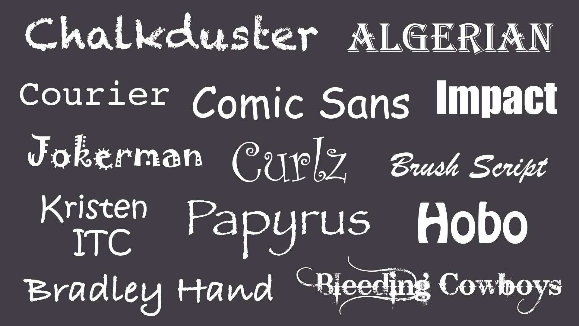
When in doubt, a more timeless, understatedfont is less likely to detract from your message. Your font choice should complement your brand, but still be current and professional.
Images
Images are a huge part of building a unique identity. Every photo, graphic, icon, and button is a chance to showcase your brand and shape the way it's perceived.

In professional settings, images are usually created specifically for the brand; for instance, pictures in a catalog or graphics in an app. If you don't have the luxury of this, you can get similar results by choosing images with a subtle through line; for example, a signature color or similar style.

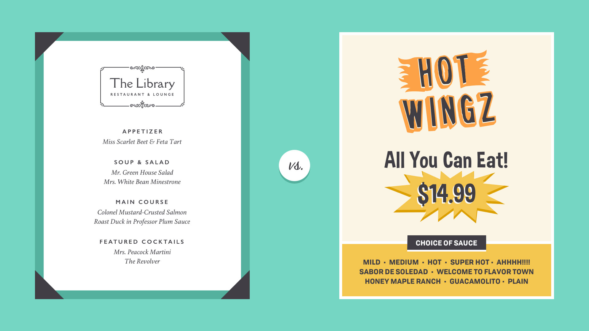
Most importantly, avoid images that feel generic or obviously staged. This is difficult if you're relying on third-party stock, but there are ways to set your brand apart.
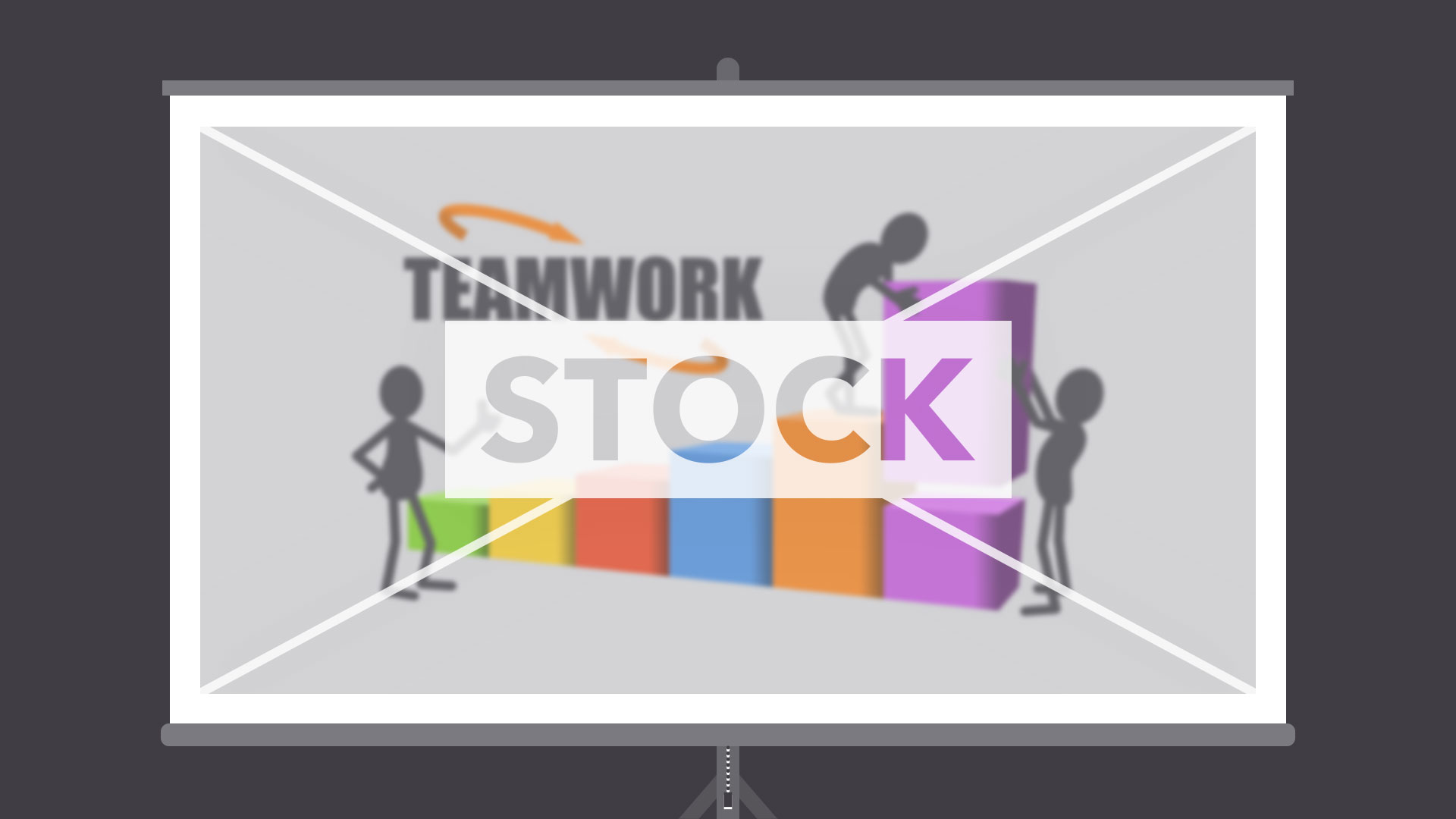
Avoid images that lack context or appear frequently in other brands' designs. Take the photo below. Some viewers might find it off-putting due to the forced pose and artificial background.

Instead, choose images that seem genuine and that feature authentic people, places, and things. The best images are the embodiment of your unique point of view. They represent how you want to be seen when people think about your brand.

Putting it all together
Visual identity isn't just a marketing tool. It's a way of looking at design that removes a lot of the guesswork. With a clear vision of your brand, you know exactly what colors, fonts, and images to use. You can create consistent works that viewers will remember.
Comments
Post a Comment