The power of color
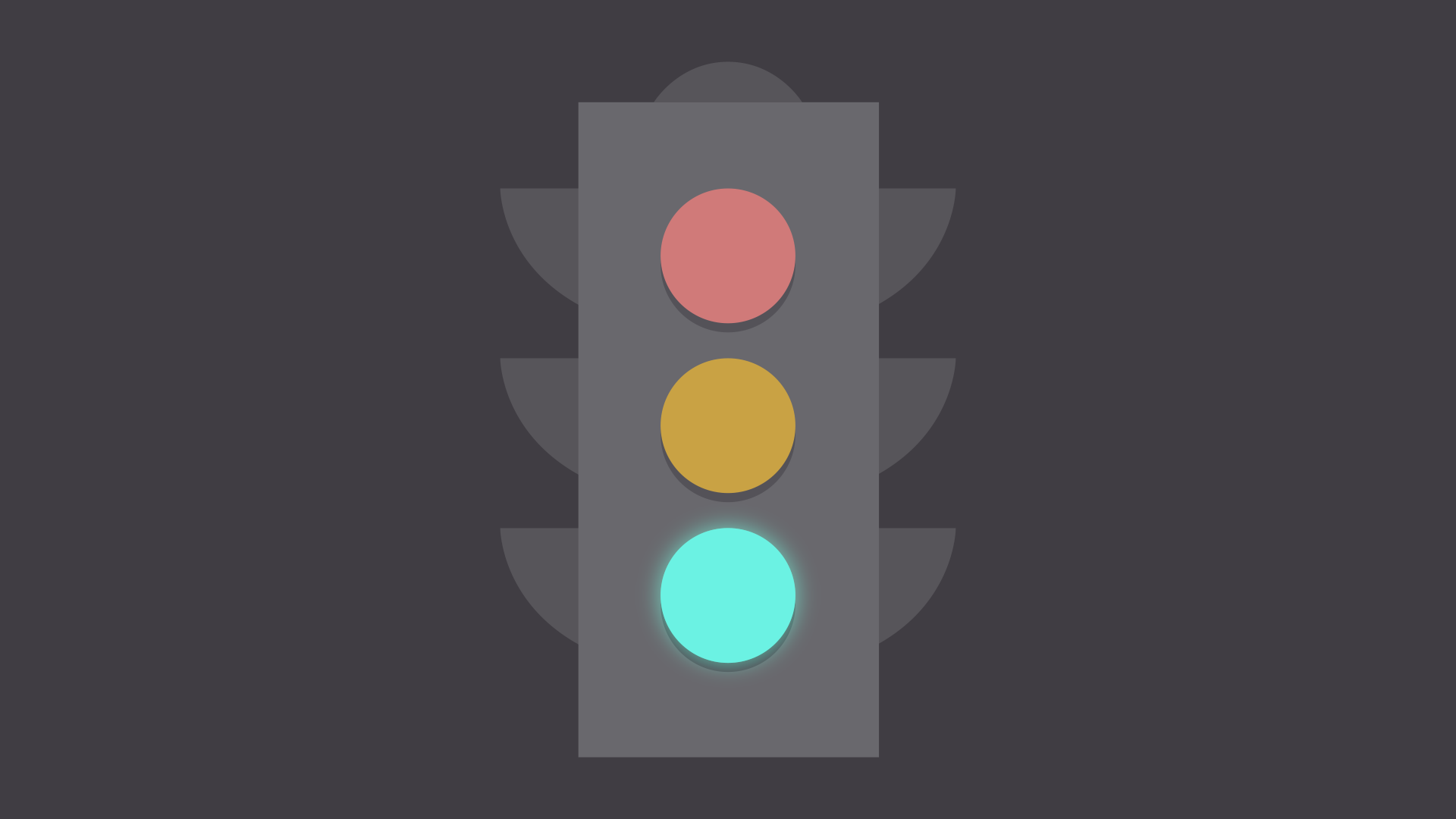
Color plays a vital role in design and everyday life. It can draw your eye to an image. Sometimes it can trigger an emotional response. It can even communicate something important without using words at all.
 So how do we know which colors look good together and which ones don't? The answer is simple: Color theory.
Artists and designers have followed color theory for centuries, but anyone can learn more about it. It can help you feel confident in many different situations, whether it's choosing colors for a design or putting together the perfect outfit. With a little insight, you'll be looking at color in a whole new way.
So how do we know which colors look good together and which ones don't? The answer is simple: Color theory.
Artists and designers have followed color theory for centuries, but anyone can learn more about it. It can help you feel confident in many different situations, whether it's choosing colors for a design or putting together the perfect outfit. With a little insight, you'll be looking at color in a whole new way.
Color basics
Let's start at the beginning with a refresher on the basics. Remember learning about primary and secondary colors in school? Then you already have some knowledge of color theory.

Secondary colors are created by combining two primary colors. Red and yellow make orange; yellow and blue make green; and blue and red make purple.
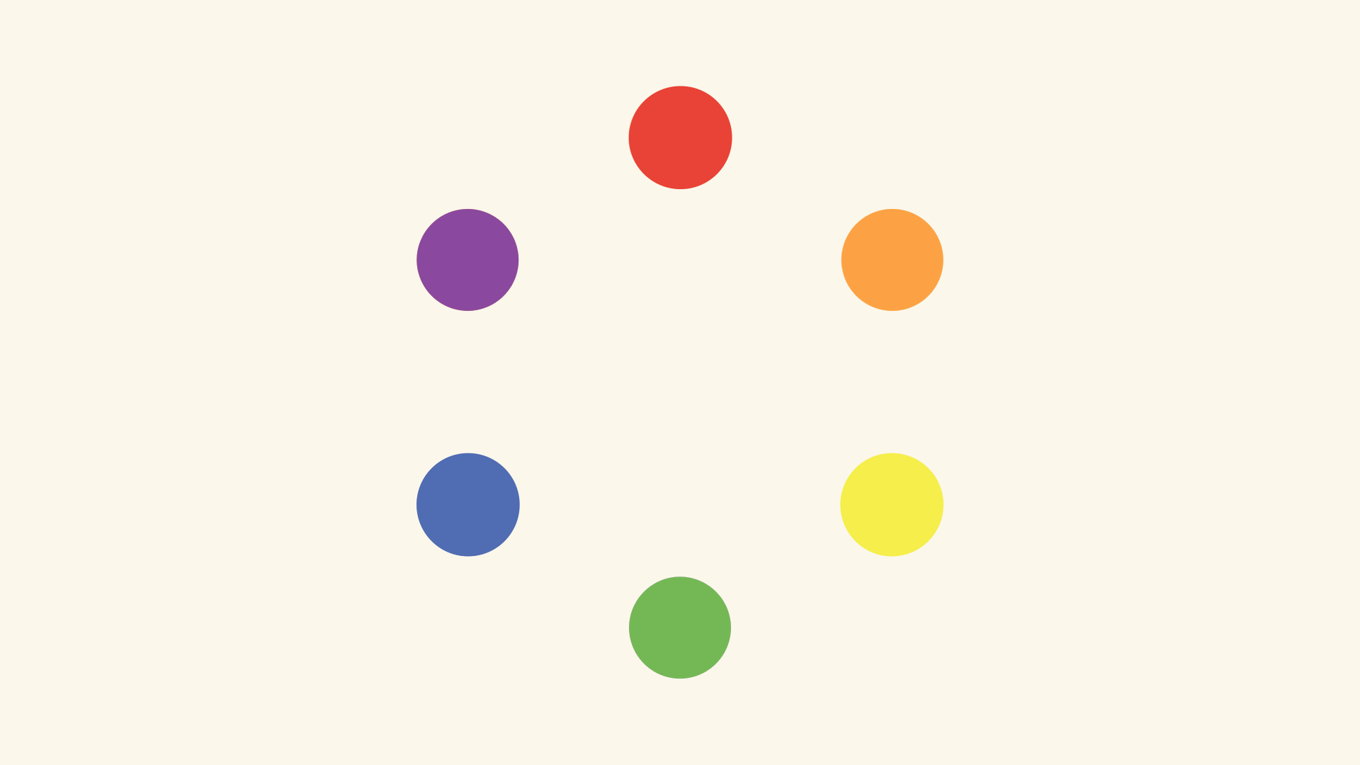
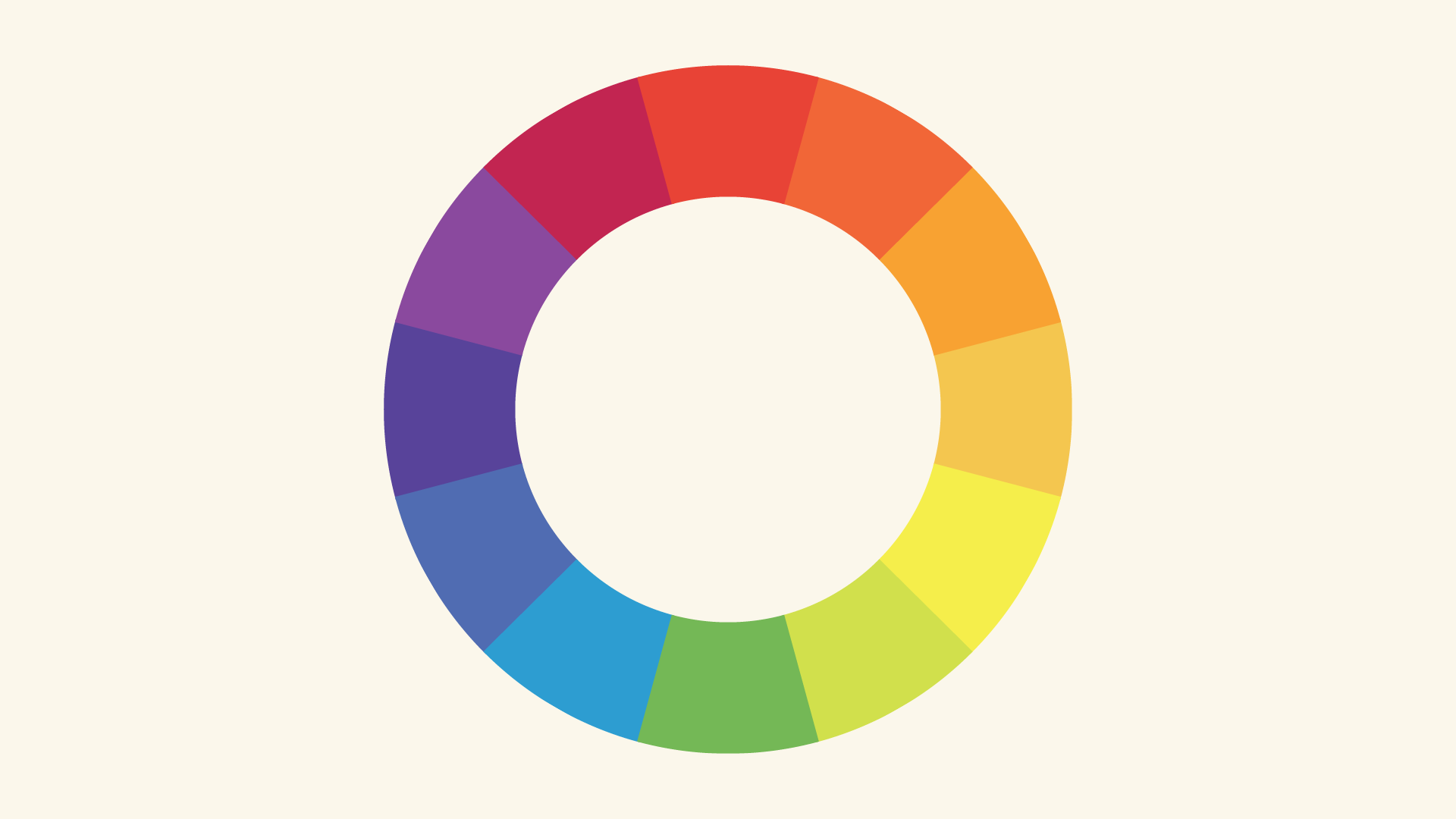
If we mix these colors together, we get even more in-between shades, like red-orange and yellow-green. All together, they form what's called a color wheel. (You can probably see where it gets its name.)
A closer look
Now that you know about the color wheel, let's take it one step further with hue, saturation, and value. These are terms you might not encounter in daily life, but they're the key to understanding more nuanced colors—like all those little paint chips at the home improvement store.
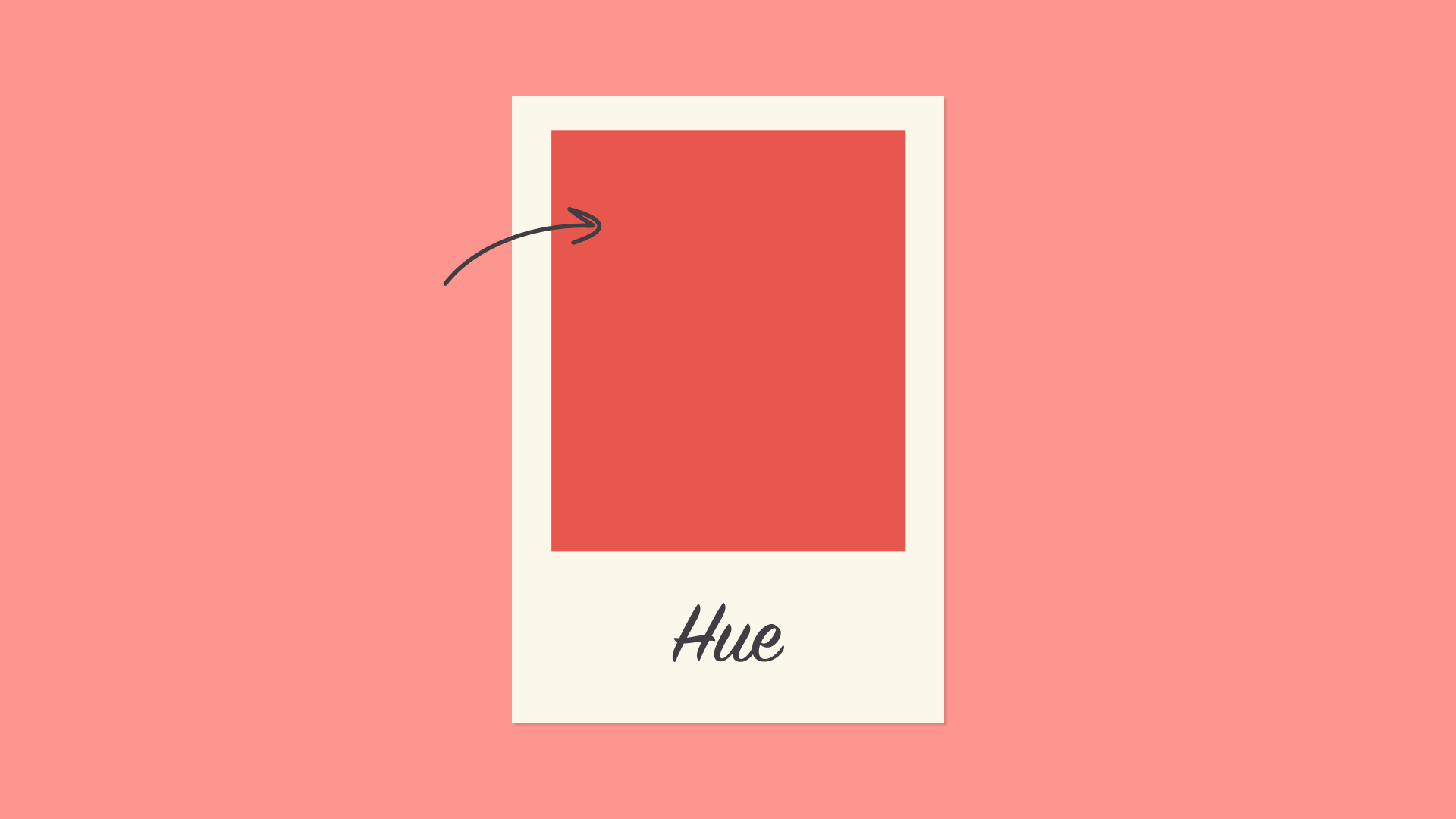
Hue
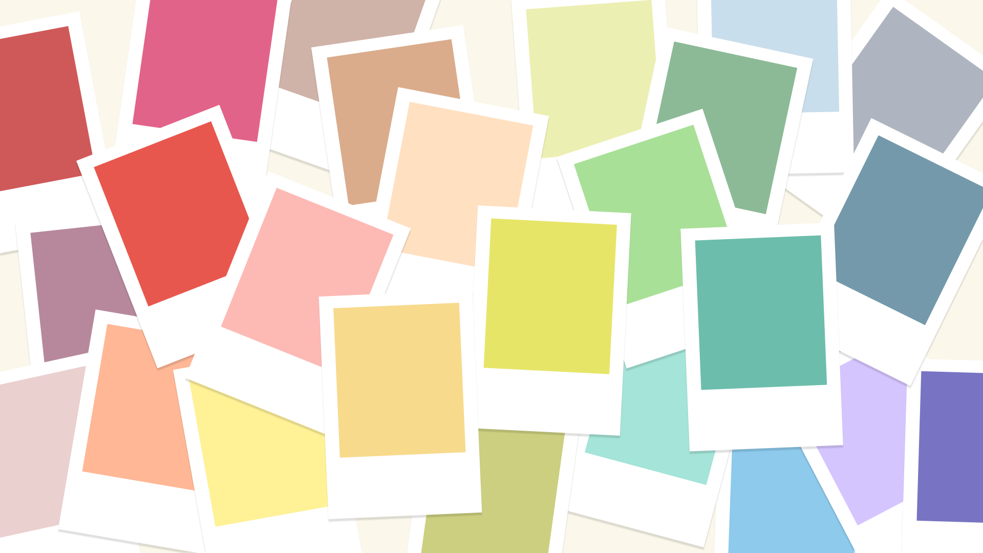
Hue is the easiest one; it's basically just another word for color. In the example below, you might describe the hue as coral pink or light red, depending on your interpretation.
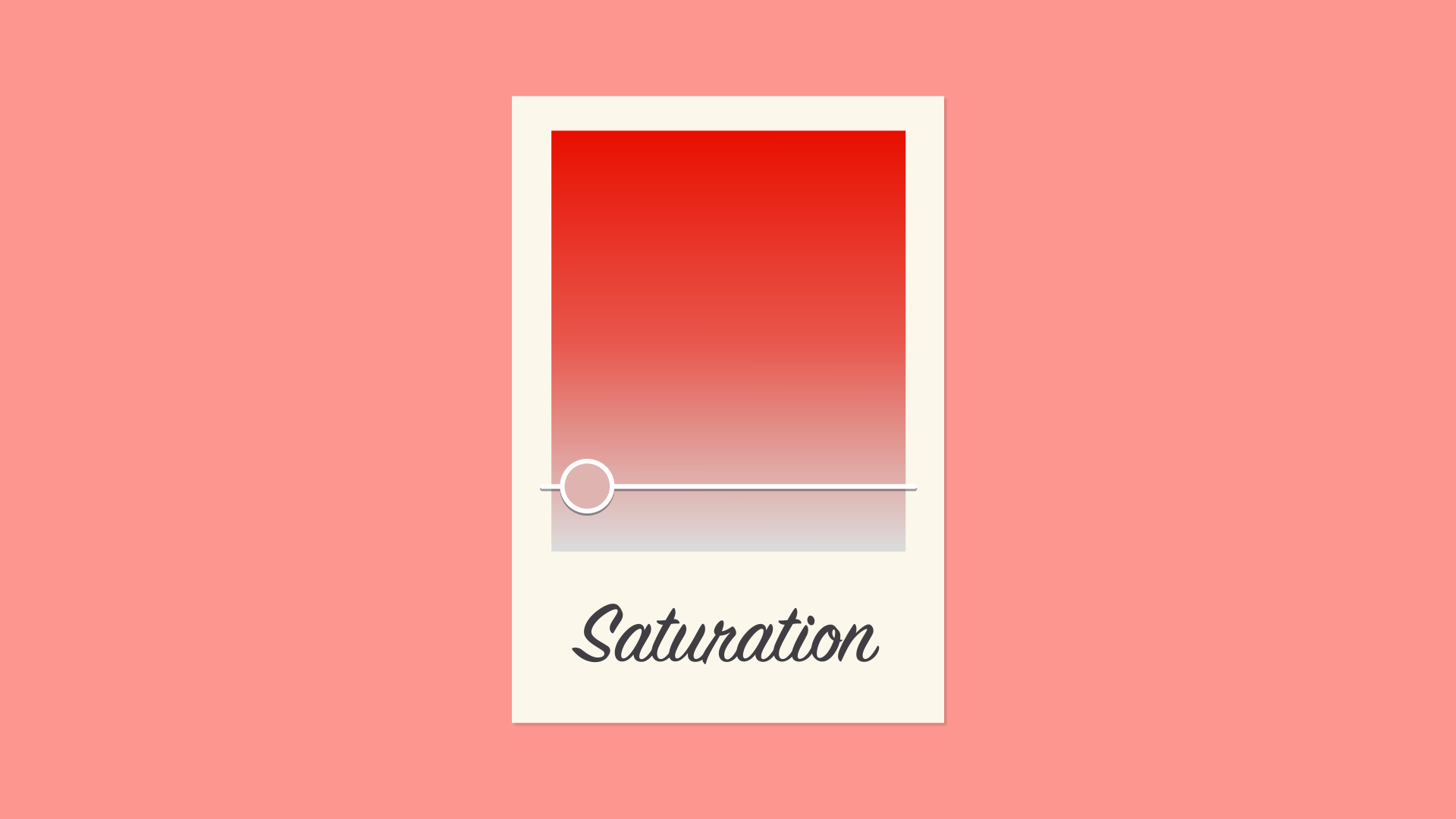
Saturation
Saturation refers to intensity—in other words, whether the color appears more subtle or more vibrant. Highly saturated colors are brighter or richer. Desaturated colors have less pigment and therefore less oomph.
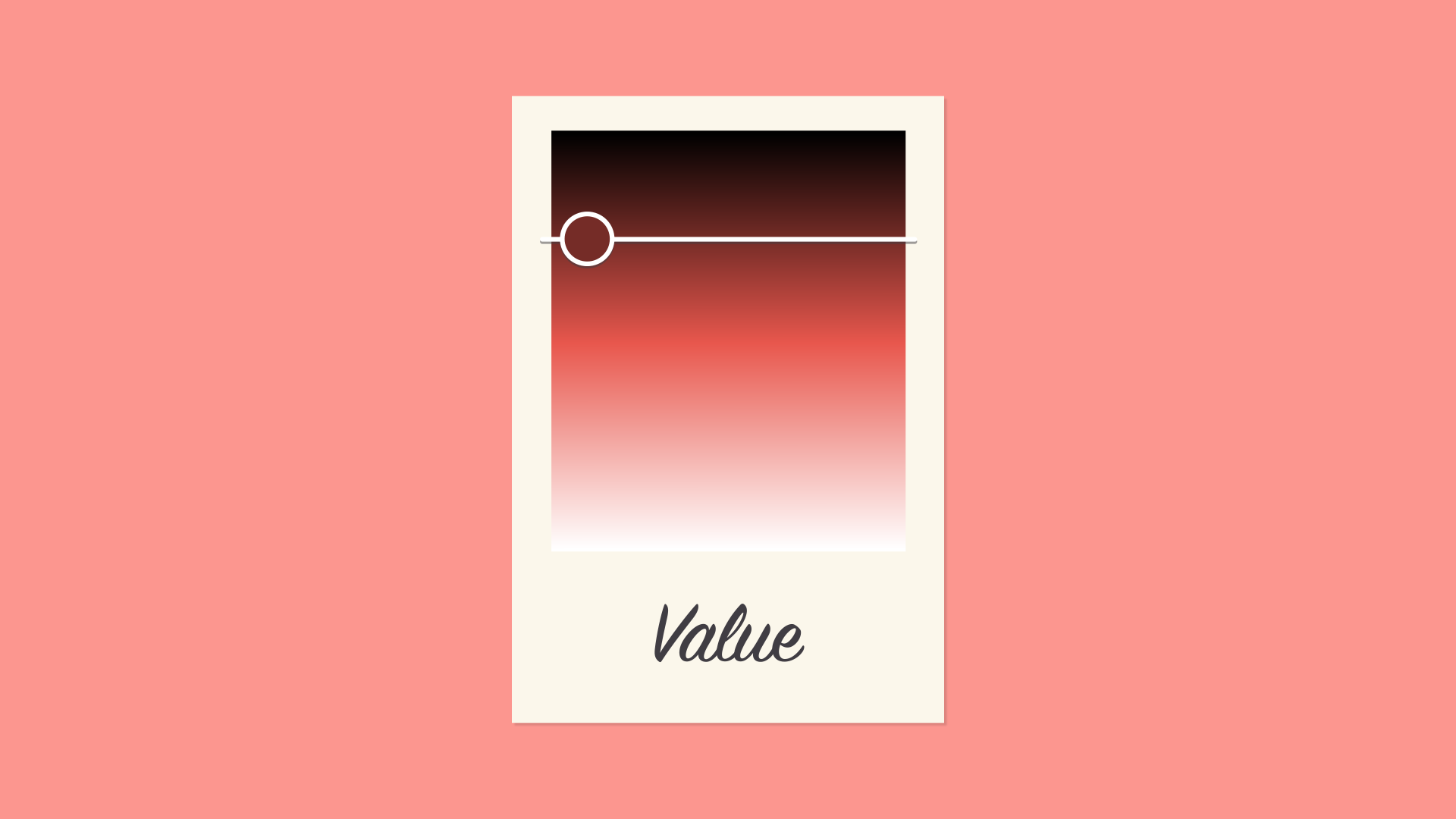
Value
Value has to do with how dark or light the color is, ranging from black to white. As you can see below, this gives us many different shades, from a deep reddish brown to a light pastel pink.
Creating color schemes
So how do we put this all together to create professional-looking color schemes? There are actually tried-and-true formulas based on something called color harmony that can help.

Color harmony uses the color wheel to illustrate time-tested color combinations. We'll explore some of the most common types of harmony below.
Monochromatic
The easiest formula for harmony is monochromatic because it only uses one color or hue. To create a monochromatic color scheme, pick a spot on the color wheel, then use your knowledge of saturation and value to create variations.
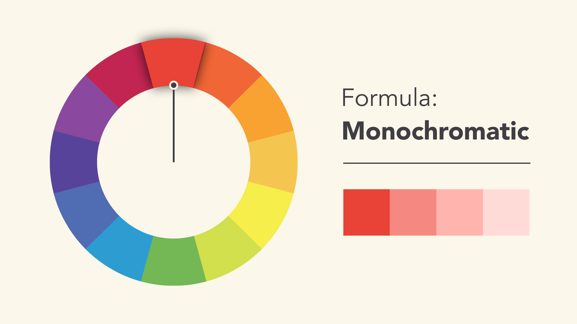
The best thing about monochromatic color schemes is that they're guaranteed to match. The colors suit each other perfectly because they're all from the same family.
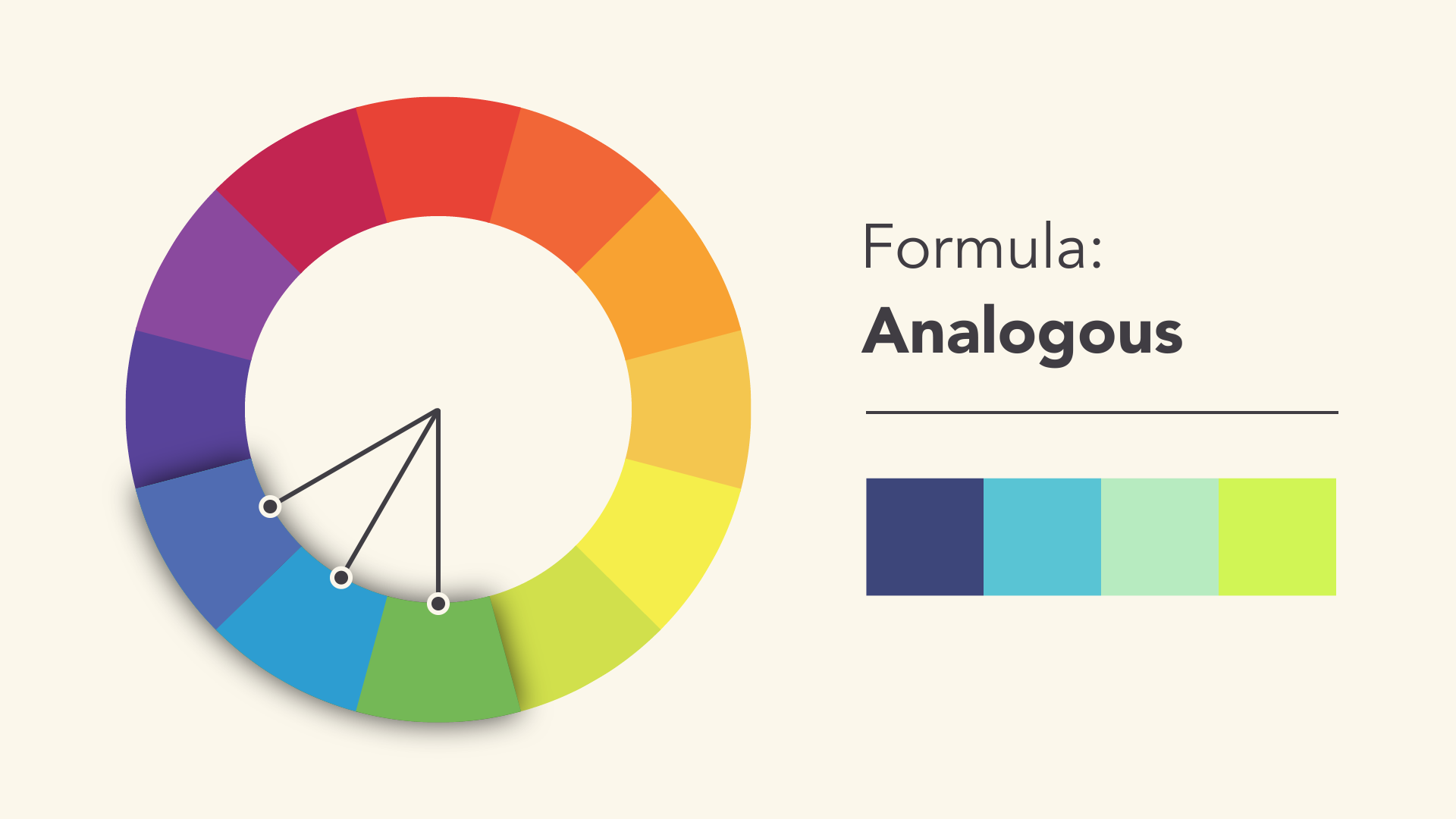
Analogous
An analogous color scheme uses colors that are next to each other on the wheel, like reds and oranges or blues and greens.
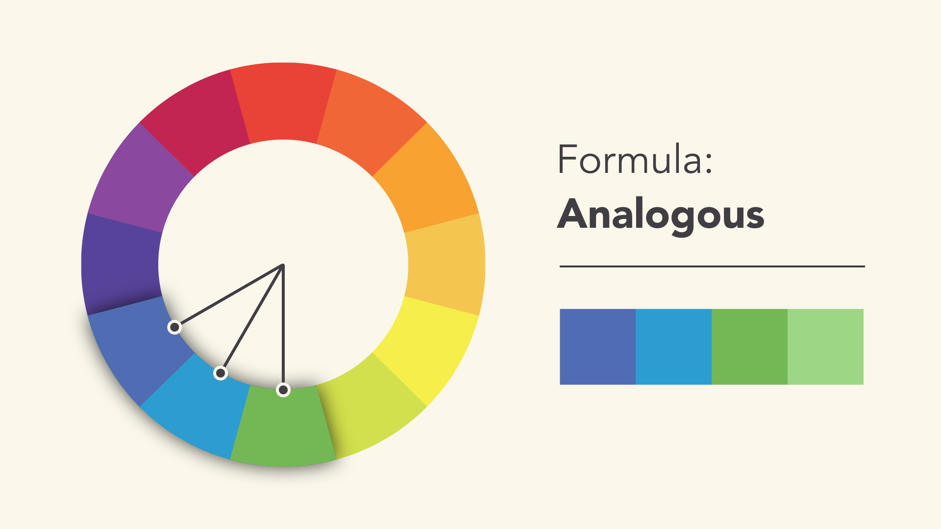
Don't be afraid to play with the palette and create your own unique interpretation. That's what color harmony is all about; the formulas are merely starting points to help guide and inspire you.
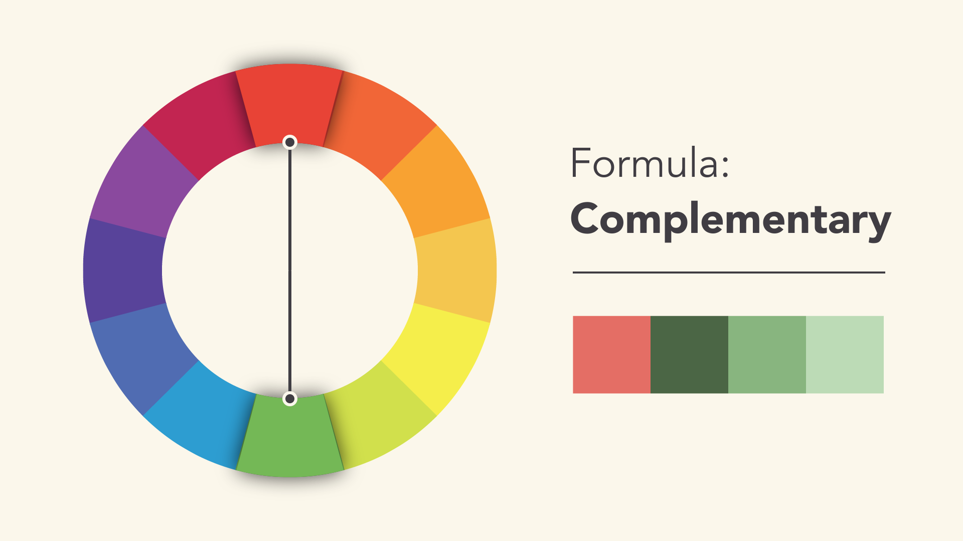
Complementary
Complementary colors are opposite each other on the wheel; for instance, blue and orange or the classic red and green.
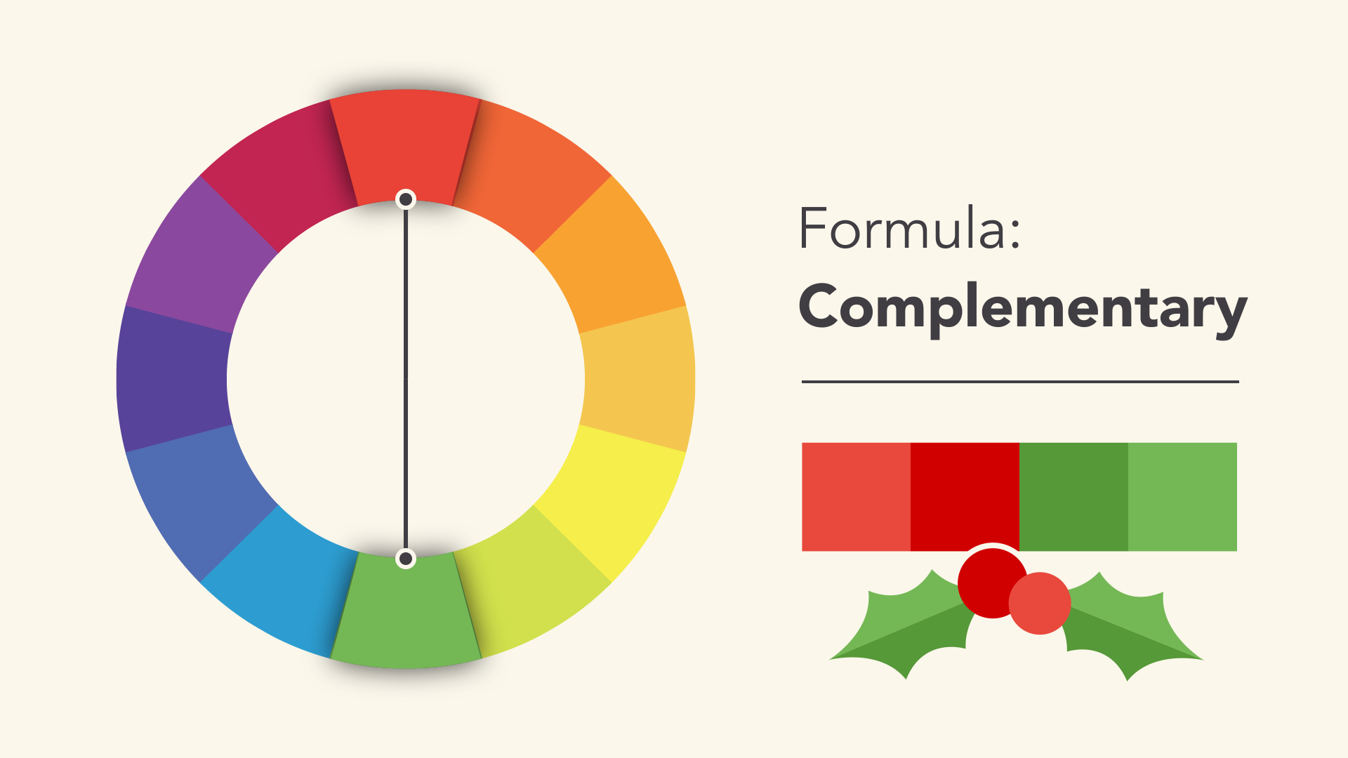
To avoid complementary color schemes that are too simplistic, add some variety by introducing lighter, darker, or desaturated tones.
Split-complementary
A split-complementary color scheme uses the colors on either side of the complement.
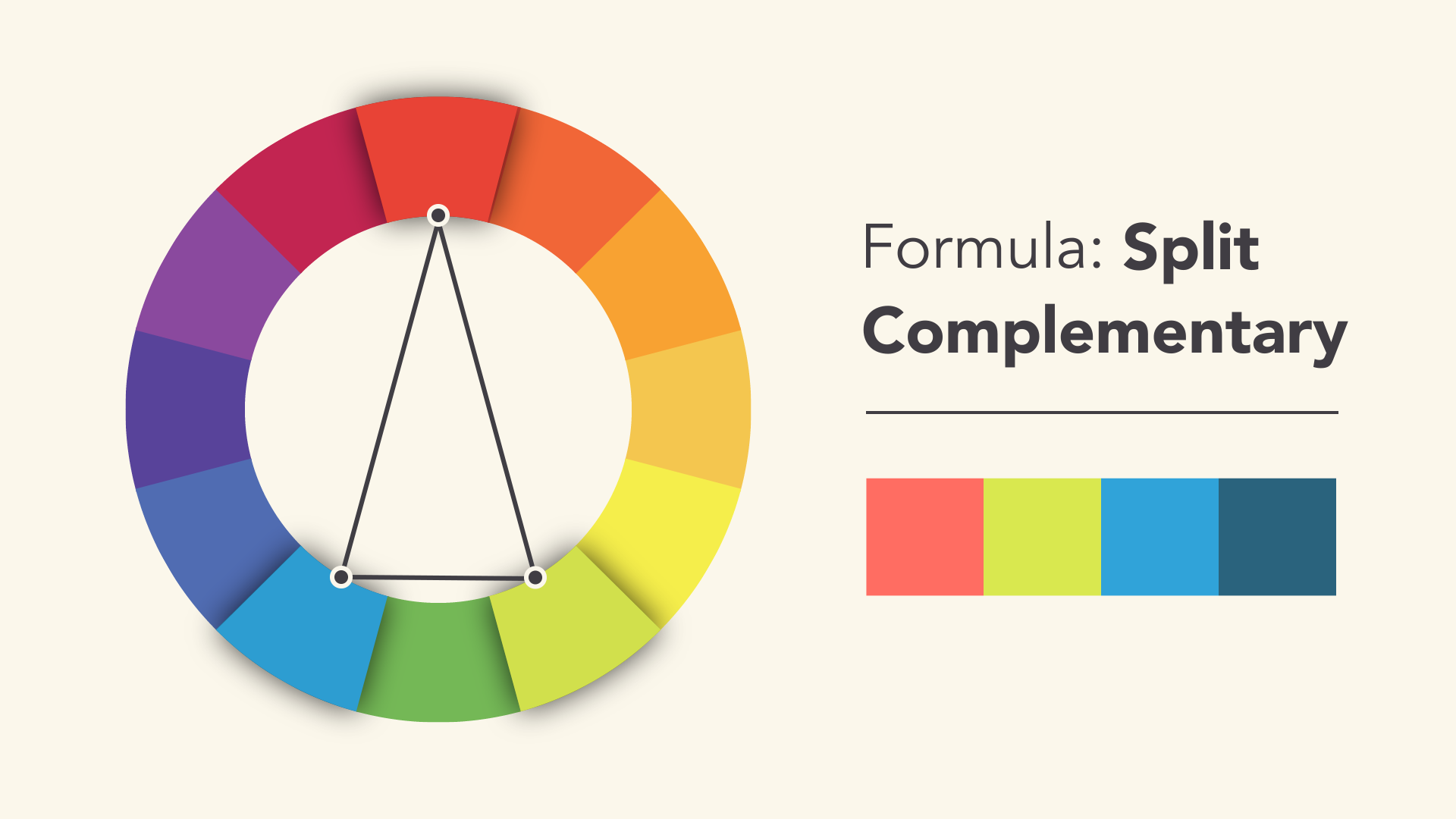
This gives you the same level of contrast as a complementary color scheme but more colors to work with (and potentially more interesting results).
Triadic
A triadic color scheme uses three colors that are evenly spaced, forming a perfect triangleon the wheel.
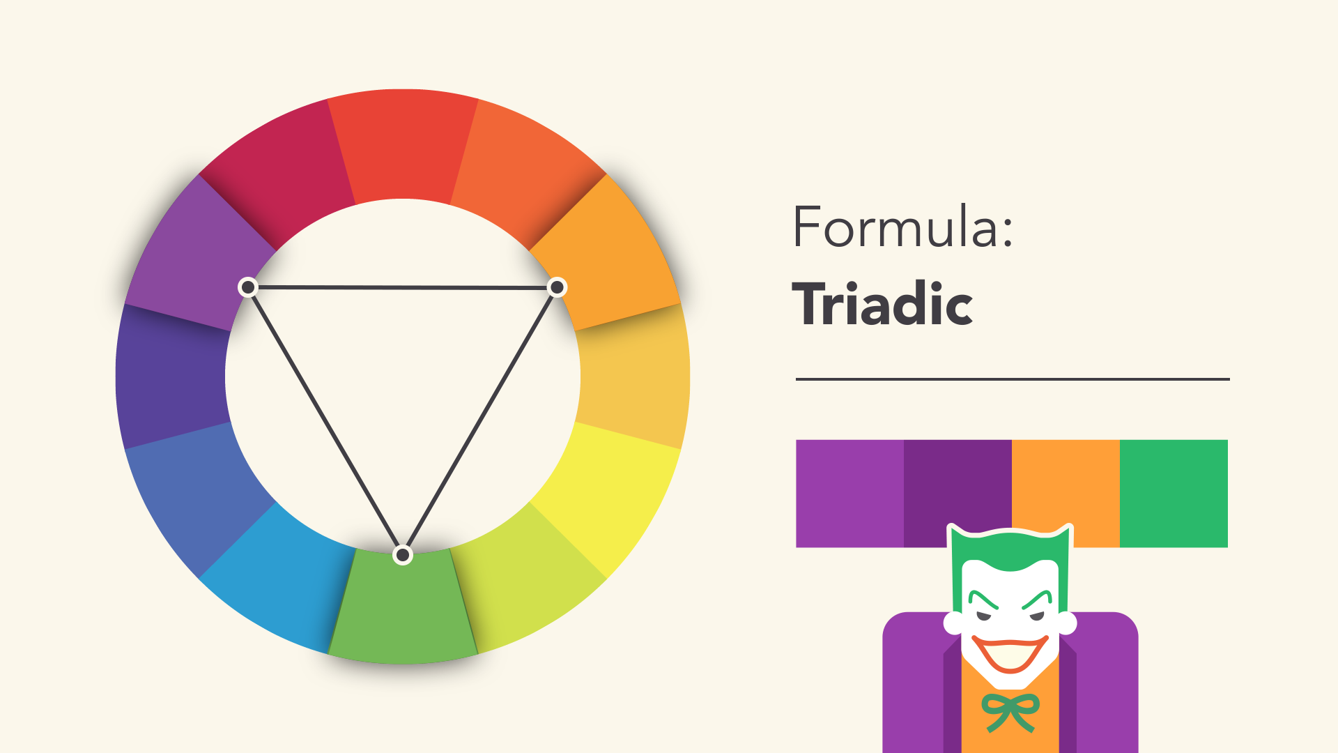
These combinations tend to be pretty striking—especially when they include primary or secondary colors—so be mindful when using them in your work.
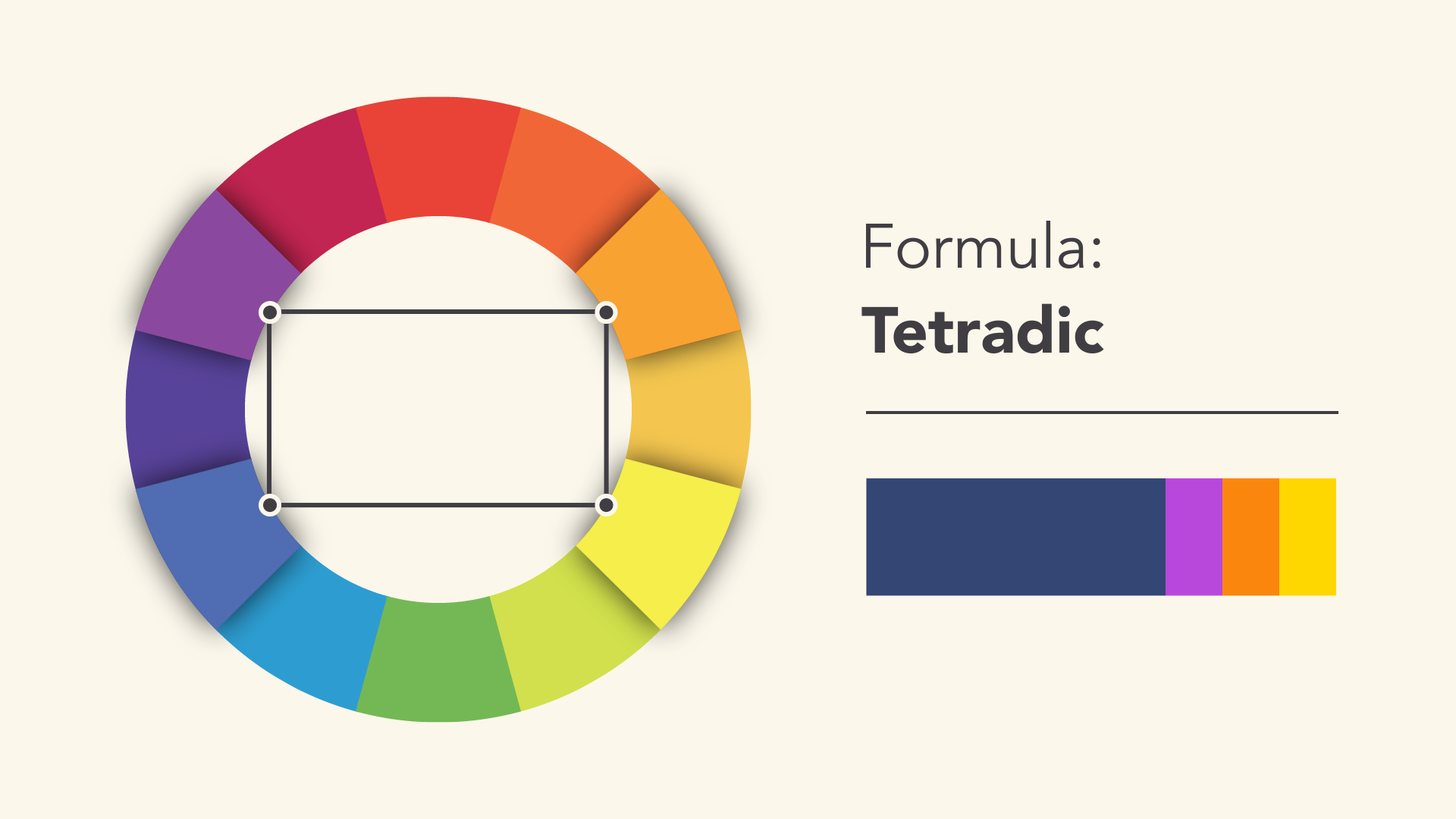
Tetradic
Tetradic color schemes form a rectangle on the wheel, using not one but two complementary color pairs. This formula works best if you let one color dominate while the others serve as an accent.
Avoiding common mistakes
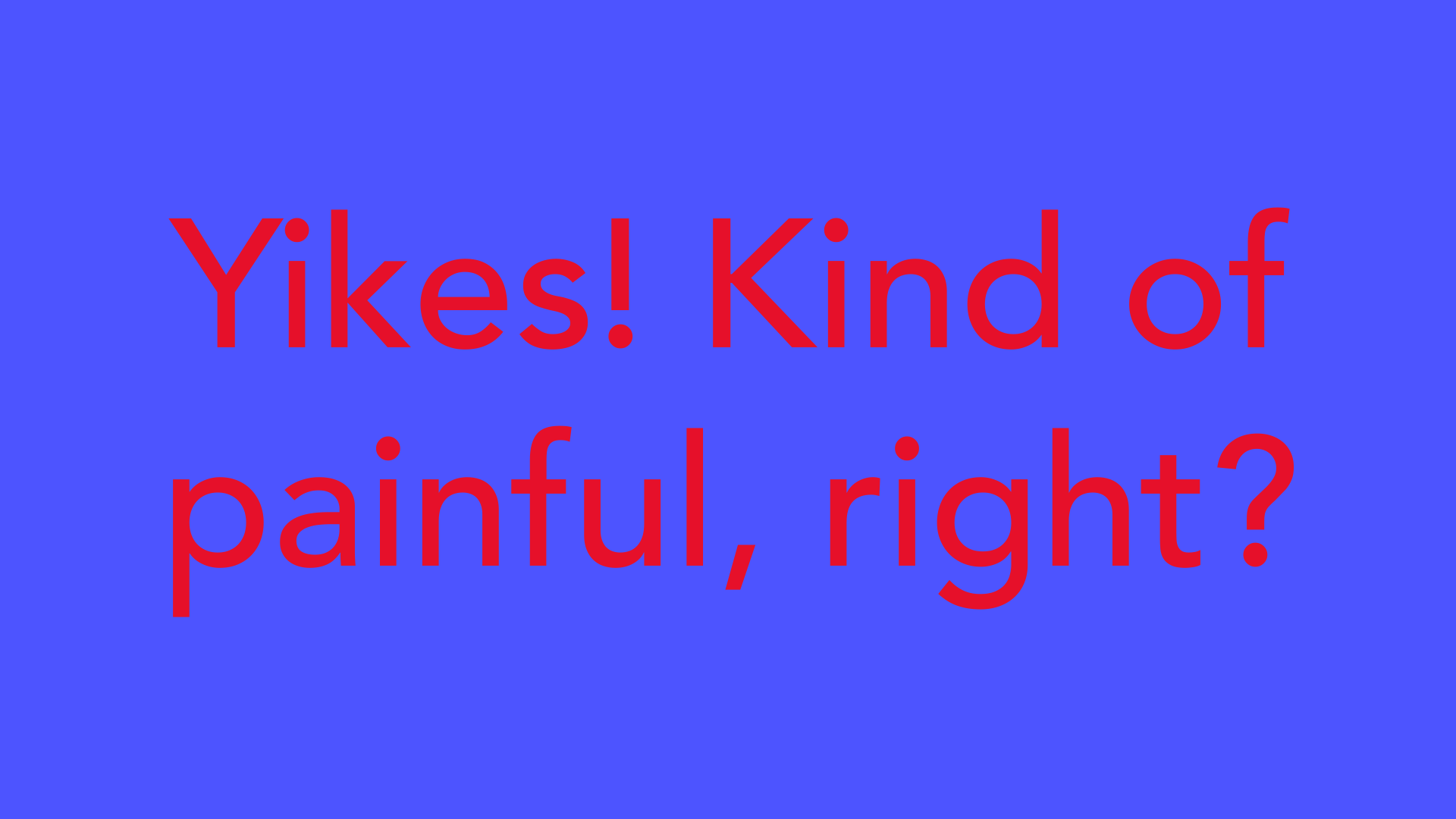
There are a few classic dos and don'ts when it comes to color. For instance, have you ever seen colors that seem to vibrate when they're placed next to each other?
The solution is to tone it down—literally—and there's a simple way do it. Start with one color, and try adjusting its lightness, darkness, or saturation. Sometimes a little contrast is all your color palette needs.
Readability is an important factor in any design. Your colors should be legible and easy on the eyes, especially when working with text.
Sometimes that means NOT using color—at least not in every little detail.

Neutral colors like black, white, and gray can help you balance your design, so when you douse color, it really stands out.

Choosing the right colors
Every color sends a message. It's important to consider the tone of your project, and choose a color palette that fits.
For example, bright colors tend to have a fun or modern vibe.

Desaturated colors often appear more serious or businesslike.

Sometimes it just depends on the context. With practice and creativity, there's no limit to what you can do.

Finding inspiration
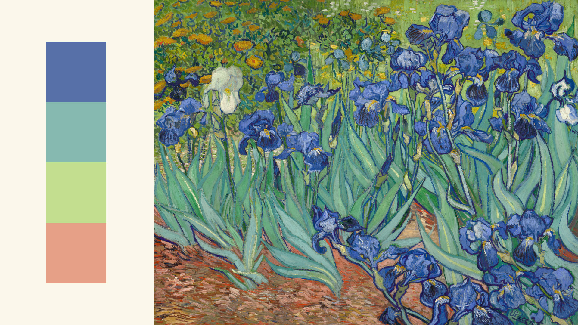
You can find ideas for color schemes in all kinds of interesting places, from advertising and branding to famous works of art.
You can even use a web resource to browse color palettes or generate your own.
Experienced designers often take inspiration from the world around them. There's nothing wrong with finding something you like and making it your own.

Putting it all together
Everywhere you look, there's color, color, and more color. It can be intimidating to use it in your work, but it doesn't have to be. Just keepexperimenting, and remember what you've learned about color theory. Soon, choosing great-looking colors will feel like second nature.

Comments
Post a Comment