Introduction
Images that come straight from a digital camera aren't always perfect. As you start to gain more experience with image editing, you may notice some recurring problems with images that you'll want to fix. For example, some images may be too bright, while others may be too dark or too blurry. There are many different corrections that can make your images look dramatically better. Some of the corrections we'll cover in this lesson include:
- Brightness and contrast: If an image is too bright or too dark, you can adjust the brightness and contrast.
- Color: If the colors in an image are muted or dull, you can use a variety of color-correction tools, such as saturation.
- Sharpness: If an image is less clearthan you'd like it to be, you can sharpen it.
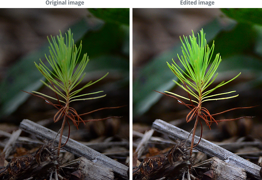
Want to see the difference that corrections can make? Take a look at the example below. It only took a few quick corrections to make the image look brighter, clearer, and more colorful.
Optional: If you'd like to follow along, you can download some or all of our example images. Just click any of the images below to open a full-sized version. Then right-click the full-sized version and select Save Image As to save it to your computer.

About this lesson
Just like in the previous lesson, we'll show you how to make these adjustments with Pixlr Express, a free, web-based image editor you can use from almost any computer with an Internet connection. If you're using a mobile device, you can use the free Pixlr Express mobile app.
If you have a different image editing program, you can still follow along—these features will work roughly the same way for most image editors. However, note that some basic image editing programs, such as Microsoft Paint, do not include all of the tools we'll discuss in this lesson.
Image editing tips
Here are a few important things to keep in mind as you start working with images. If you're new to image editing, we also recommend reading the first lesson in this tutorial.
Keep your originals: If you're planning to make even basic changes to an image, you should also keep an original, unedited version of the file. We recommend making a habit of doing this whenever you're working with image files. This way, you'll always be able to go back to the original version.
Combine different adjustments: You may find that images are often in need of more than just one correction. For example, some images might be improved by both brightness and color adjustments, while others can benefit from cropping and sharpening. It's all about finding what works to bring out the best in each image.
Experiment: There's no perfect formula for editing images. As long as you keep a copy of the original file, you should feel free to try out different adjustments to find what works for that image. If you change your mind later on, you can always go back to the original version and start over.
Brightness and contrast

Sometimes an image may look too bright or too dark. This can be caused by several different factors, including the lighting where the photo was taken and camera settings. You can offset this by adjusting the brightnessand contrast of the image.
Brightness
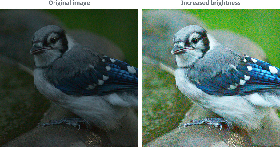
When you adjust the brightness, you're changing the overall level of light and dark in the image. So if an image is too dark, you can try increasing the brightness, as in the example below:
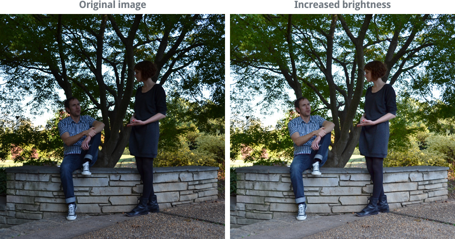
However, increasing the brightness for a very dark image can lead to a lot of image noise, or graininess. That's because you're also brightening any noise the image may have. In the example below, you may notice that the green background in the image on the right looks rough and grainy. We'll talk more about reducing image noise later in this lesson.
Contrast
When you increase the contrast, you're making the difference between the light and dark areas of the image more noticeable. In other words, you're making the dark parts darkerand the light parts lighter. In the example below, notice how the sky at the top of the image becomes brighter, but the trees and rocks become darker:
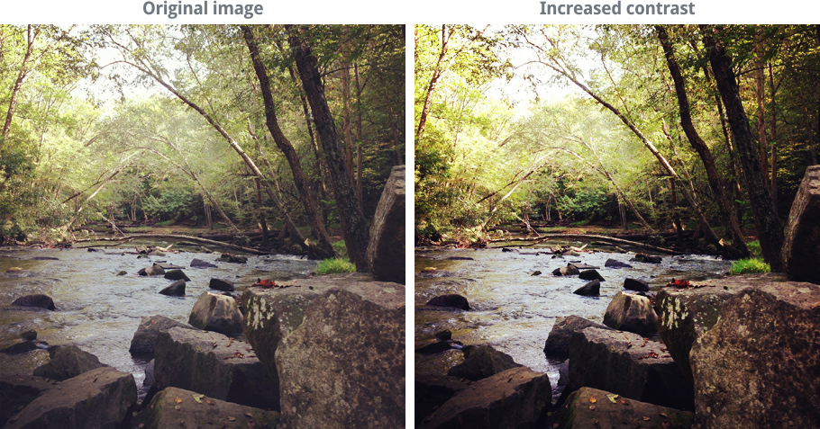
However, increasing the contrast too much can lead to a loss in image detail. It will also usually increase the saturation of the image, which we'll discuss in more detail on the next page.


To adjust the brightness and contrast:
Remember, we'll be using Pixlr Express throughout this lesson, so this process may vary depending on the software you're using.
- Go to Pixlr Express in your web browser, then click Browse to open the image from your computer.
- Click the Adjustment button, then click Contrast.
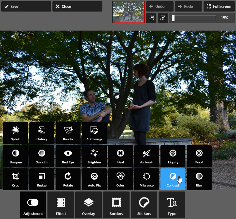
- Click and drag the sliders to adjust the brightness and contrast. Take some time to try out different combinations to find what looks best for the image—a preview will appear as you adjust each setting. In this example, we're actually decreasing the contrast to prevent the brightest parts of the image from looking too bright.
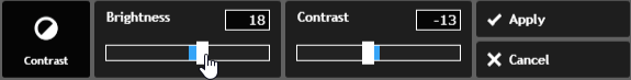
- Click Apply. The brightness and contrast will be adjusted. If desired, click the Save button to save this new version of the image.
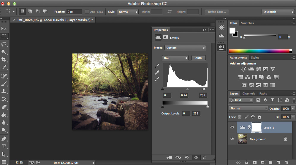
- Many advanced image editing applications, such as Photoshop, also include other tools to adjust these settings, such as levels and curves. These tools are similar to ones shown above, but they'll give you an even finer level of control over the brightness and contrast. To learn more about using levels and curves, check out our Photoshop Basics tutorial.
Color corrections
There are many times when you may want to adjust the colors in an image. For example, you may want to highlight certain colors in the image or even change the colors for artistic effect.
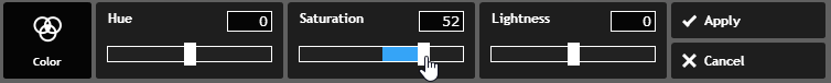
Saturation
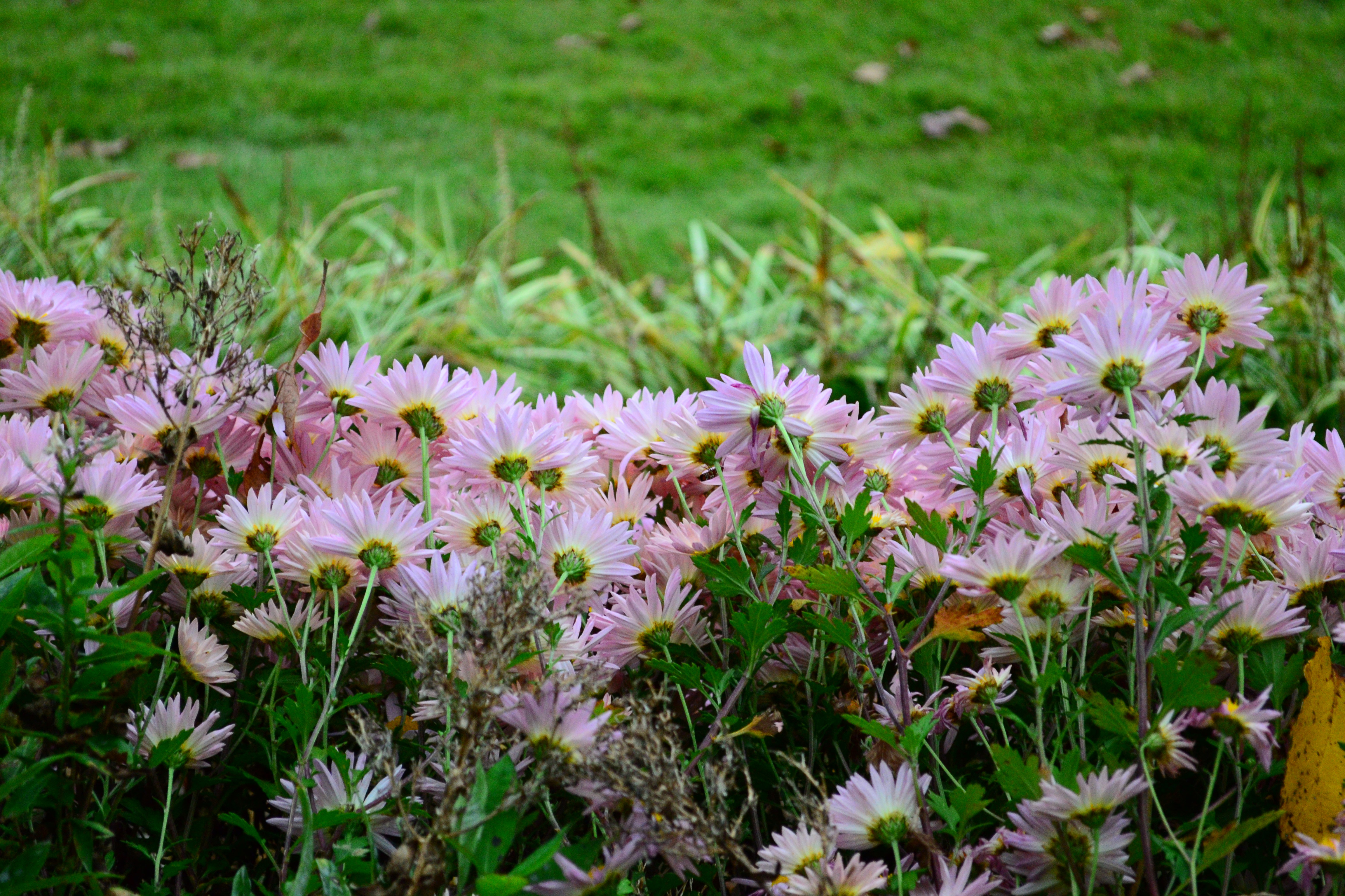
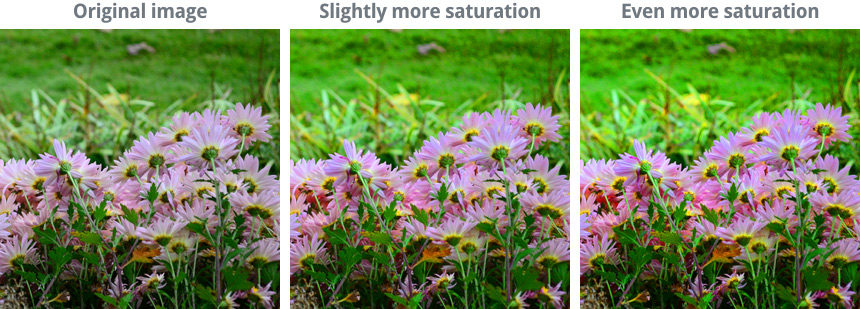
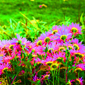
Sometimes the colors in an image may appear to be dull or muted. You can compensate for this by increasing the saturation, which can make the colors look richer, or more vivid. You can see an example of this in the images below:
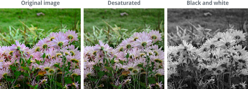
On the other hand, you can reduce the saturation to make the colors less vivid. If you remove the saturation completely, it will produce a black-and-white, or grayscale, image. You can see an example of this in the images below:
To adjust the saturation:
- With the image open in Pixlr Express, click the Adjustment button, then click Color.
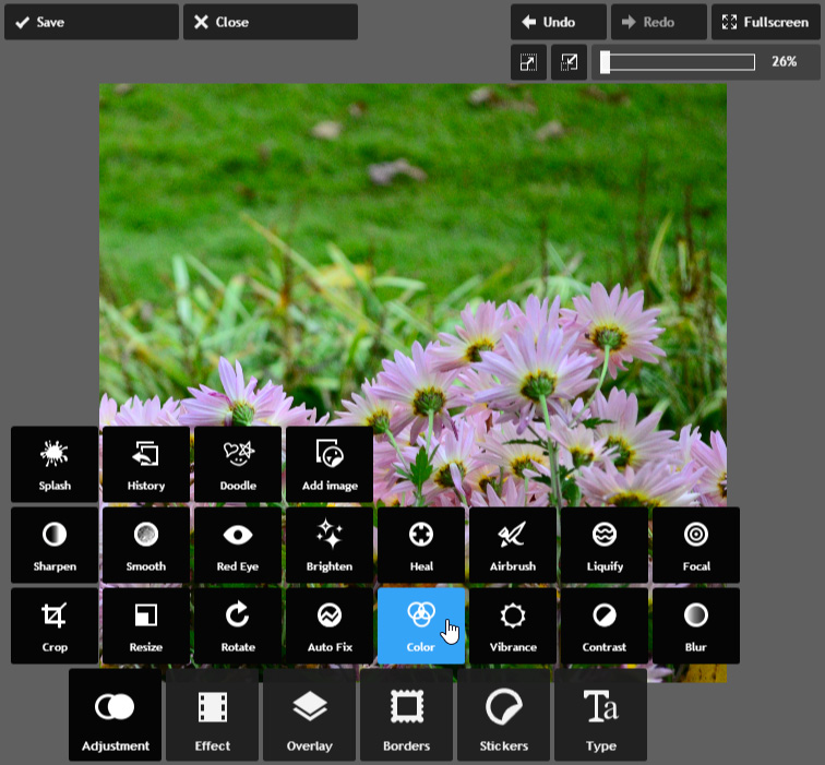
- Click and drag the Saturation slider to increase or decrease the saturation—a preview will appear as you adjust the setting.
- Click Apply. The saturation will be adjusted. If desired, click the Save button to save this new version of the image.
- Be careful not to increase the saturation too much. This can cause the colors to look unnatural, as in the example below:
Other color corrections
There are many other ways to adjust the colors in an image. Color-correction tools may vary depending on your image editing application, but you can learn more about some common ones below:
Hue: This tool changes all of the colors in the image at the same time. This will often result in an unnatural color combination, so we only recommend using this option for artistic effect.
Vibrance: This tool lets you boost the saturation for the parts of the image that are less colorful without over saturating the parts that are already colorful. This helps prevent the colors from looking unnatural.
Temperature: This tool adjusts how warm or cool the colors in the image appear. In general, a warmer temperature will look more red or orange, while a cooler temperature will look more blue.
Filters: Many apps, such as Instagram, have predefined combinations of color adjustments that you can quickly apply to create interesting effects. For example, they can make your photos look like they were taken with a vintage camera.
Sharpening
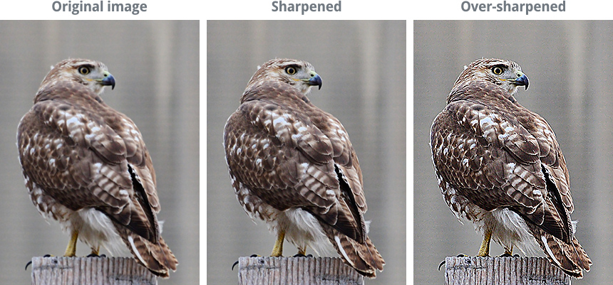
Sometimes an image may not be as clear as you'd like it to be. Sharpening can help make your images look crisp and clear by enhancing the edges of objects in the image. However, adding too much sharpness can actually make an image look worse, or lead to a loss in image detail. Take a look at the example below:
As you can see, the right amount of sharpness makes the photo look very crisp—for example, in the center image, it's easy to see the edges of the bird's feathers. But adding too much sharpness can cause the edges to look exaggerated and unnatural, as in the image on the right. You may have also noticed that the background in the over-sharpened image has a lot of added image noise.
Just like the other adjustments we cover in this lesson, you'll need to use this feature carefully. Removing too much noise from the image can result in blurriness and a loss of detail.
To sharpen an image:
- With the image open in Pixlr Express, click the Adjustment button, then click Sharpen.
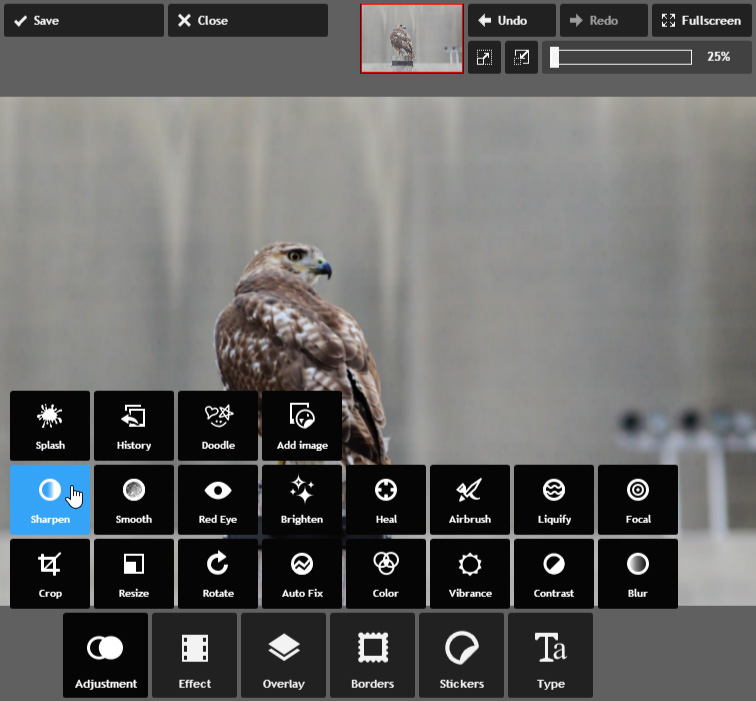
- Set the desired amount of sharpnessto add, along with the radius. The radius controls the size of the details that will be sharpened, so it's generally best to use a very low number for this setting. Take some time to try adjusting both the amount and radius to see the effect—a preview will appear as you adjust each setting.
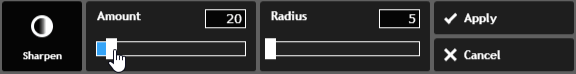
- Click Apply. The image will be sharpened. If desired, click the Save button to save this new version of the image.
- If you want to learn more about sharpening, check out this tutorial from Cambridge in Colour.
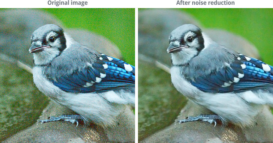
Image noise
Some images may have a lot of noise, which causes them to look grainy. You can compensate for this by reducing the image noise, as in the example below:
Just like the other adjustments we cover in this lesson, you'll need to use this feature carefully. Removing too much noise from the image can result in blurriness and a loss of detail.
To reduce image noise:
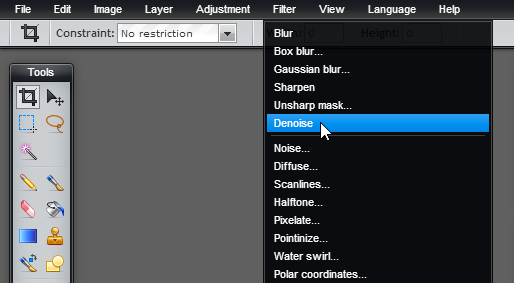
Like many basic image editing applications, Pixlr Express does not include a noise-reduction tool. You can, however, use the free Pixlr Editor to reduce image noise if this tool is not included in your image editing application.
- Go to the Pixlr Editor, then select Open image from computer to open the image.
- Click the Filter menu, then select Denoise. In other applications, this option may say Reduce Noise.
- Some noise will be removed from the image. You may need to use this tool more than once to remove the desired amount of noise.
- If desired, click the File menu, then choose Save to save this new version of the image.
- If you're using Photoshop, you'll be able to adjust the amount of noise that is reduced. For more information, check out our Photoshop Basics tutorial.
Automatic adjustment tools
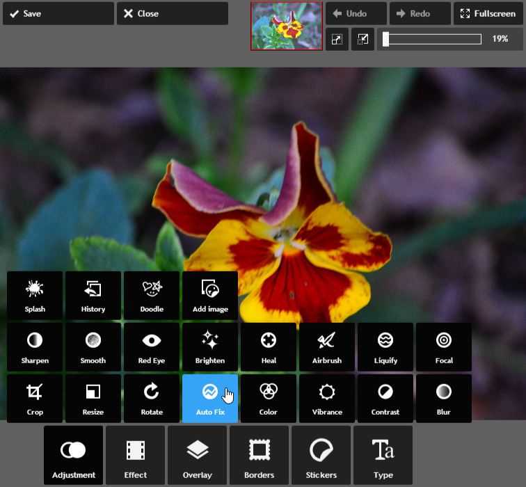
If you're not exactly sure what kind of corrections to use—or if you're just looking for a quick way to make your images look better—many applications include an automatic adjustment tool. This feature will analyze the image and then make corrections to try to improve its appearance. In Pixlr Express, this tool is found under Adjustment Auto Fix.
Auto Fix.
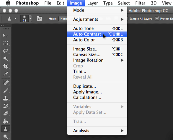
Other applications, such as Photoshop, may have more specific auto-adjustment tools. Photoshop has several options, including Auto Tone, Auto Contrast, and Auto Color.
Most of the time, these tools will improve the overall look of an image. However, you can always manually adjust an image after using them. One idea might be to use an automatic adjustment tool first, and then make smaller corrections to get the image to look exactly the way you want.
Other common corrections
There are several other corrections you may need to make, depending on the types of images you're editing. For example, many image editing applications include a red eye-removal tool, which you can use to fix a common problem that happens when the camera's flash causes a subject's eyes to look red. Many programs also include a set of touch-up tools, which you can use to remove blemishes or unflattering details from images.
Totally informative post. Keep doing that things
ReplyDeletePhotoshop Tutorials Step by Step for Beginners Basic Introduction